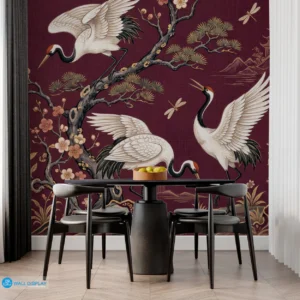
Two different wallpaper patterns on the same wall can look bold and beautiful. Or it can look like a fabric store exploded. The difference comes down to a few simple rules. Get the mix right, and the room gains depth and personality. Get it wrong, and guests will feel dizzy.
Here is how to pair patterns with confidence. Grab wall paper online from a trusted shop and follow these practical rules.
Find a shared color:
Focus on colors first. Pick two different designs that share at least one common shade. If a floral print contains a hint of soft blue, pair it with a geometric pattern featuring that exact same blue. Matching colors creates a bridge between styles. This link tricks the eye into seeing unity even when the patterns look different.
Play with scale:
Combine a large print with a tiny, delicate design. A massive floral mural looks fantastic next to subtle, thin stripes. Small patterns act like solid colors from a distance, which prevents the room from feeling crowded. Contrasting sizes stop the eyes from feeling overwhelmed while keeping interest alive.
Balance busy with calm:
Drenching every wall in busy designs causes headaches. Apply a bold, energetic pattern to a single accent wall. Cover the remaining walls in a neutral print or a simple texture. Allowing a quiet pattern to sit beside an active one provides a place for the vision to rest. This method keeps the space feeling airy.
Think about flow:
Connect rooms through a common theme. If a hallway features a leafy design, use a wallpaper in the next room that picks up those green tones. Consistency in color palettes helps the home feel cohesive. Transitions between spaces should feel intentional. Keeping a thread of similarity throughout the house ties distinct areas together beautifully.
Stick to a mood:
Decide on a vibe before choosing patterns. Romantic designs blend well with vintage floral prints. Modern spaces benefit from sharp lines mixed with abstract shapes. Mixing patterns from similar eras keeps the atmosphere grounded. Matching the mood helps disparate prints feel like they belong together in the same home.
Use white space:
Neutral areas act as a buffer. Use wainscoting or simple trim to break up wallpapered sections. A solid strip of paint between two patterns creates a clean border. This physical gap gives the eyes a break. Using space effectively turns a potential clash into a polished layout. Proper placement ensures that both designs shine without fighting for attention.